There are over 2.87 million apps available on Google App Store and over 1.96 million in the Apple App Store. Furthermore, it is expected that these mobile apps will generate a revenue of $935 billion this year. Even though numerous apps exist in different app markets, not all are successful. What decides the success of an app? Functionality plays a crucial role. However, apart from providing value to the users, the apps also need to have an intuitive design to ensure that the users stick to the app. Therefore, after the usability of the app is clear, the developers should work on building an intuitive app and here is how to design it.
A Great Design
An app needs a great design and the right features and functions. A great design is the best way to tap into the users’ emotions. With the design of an app alone, it is possible to make it downloadable from an app market.
The color, graphical element and even the font of the text are crucial to ensure an excellent design. The developer can start by narrowing down the color scheme, the app’s layout, and the design element. Also, when designing an app, simplicity is the key. No one loves a cluttered app which can overwhelm them.
Distinguishable Tappable and Non-Tappable Elements
Not all elements visible in an app are tappable. Their design should make the element distinguishable to avoid confusion between tappable and non-tappable elements. For instance, a blue underlined text immediately informs that the text is a hyperlink. The same logic needs an extension to the mobile app.
With a clever play of placement, size and color, it is possible to distinguish between tappable and non-tappable elements.
Provide Control To The Users
When a user downloads an app, they expect to have control over the app while using it. Therefore, the developers should avoid unplanned interaction in the app. Furthermore, the pathway should be defined. Users should know what will happen when they take action without any shocking element. Also, while designing the app, the developer should work on following the same design pattern to reduce the learning curve for the user.
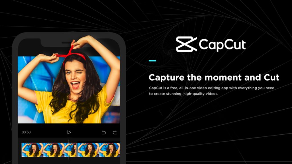
CapCut is an excellent example of understanding how the developer can give total control to the users. All the features in the app are clearly mentioned allowing the users to know what they can expect.
Simple Menus and Navigations
The menus of an app and website are different. Websites often have the luxury of including multiple menus or a menu with plenty of options. However, an app works on small screen space. Therefore, a mindful design is necessary for the menu and navigation bars. Furthermore, the primary menu should only include essential pages.
Also, the users should not face any difficulty navigating through the app. An intuitive app always ensures smoother navigation. Furthermore, keeping the design and the design in alignment is possible with concise and clear labels.
Wise Use of Space
The app’s layout is important to avoid overwhelming the users with plenty of information at once. One way to keep the layout simple is by using the available space wisely. In addition, it is crucial to understand that removing unnecessary elements from the app is as essential as adding important aspects.
Black space is crucial to increase the sophisticated look of an app. However, unnecessary compromises such as reducing the size of icons or buttons, which makes tapping difficult when creating a blank space, should be avoided.
One Action In One Screen
One app screen should only support one action to keep the interface clean and confusion-free. A screen which houses more than one primary action often needs clarification. However, the presence of necessary action is crucial. Therefore, keep the action limited to one whenever possible.
The MPL app has a withdrawal status menu within it. When a user navigates to it, only the relevant information related to the withdrawal is available. It is an excellent example of serving one action on one screen.
Right Font
The text used in the app should be easy to read without disturbing the design elements. The optimal font for an app is 11-14 sizes. Anything less than this will strain the eyes of the users. Similarly, anything larger than this might not look suitable for the design. Apart from the default font, if the developers wish, they can also give the users the option of customizing the font size according to their requirements.
An intuitive app is easy to understand. It is because it focuses on the interface and considers the entire user experience. Therefore, many users highly value this experience. Thus, the developers need to design the UI accordingly.