YouTube tests its redesigned interface on the web by moving autoplay controls inside the video player
YouTube was currently testing its redesigned interface on the web by placing the autoplay toggle directly inside the video player.

Back in October, YouTube had redesigned the video watching experience on Android and iOS devices.
At the moment, YouTube’s autoplay toggle resided in the right sidebar as part of its “Up Next” section that previewed what was coming.
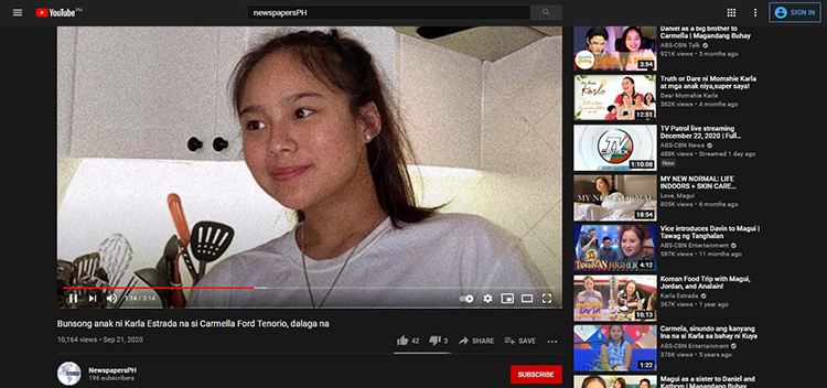
YouTube’s new design brought it directly into the platform’s video player as it appeared to the left of “Closed Captioning” and “Settings” with a play/pause button that reflected the current state and matched the mobile app design.
In addition, it disappeared when users weren’t hovering directly over it as part of the player, thus, resulting in a cleaner interface than its previous interface.
READ ALSO: YouTube On Android To Flag Hate Comments, To Give Users A Chance To Be More ‘Respectful’
While YouTube had stopped explicitly labeling what the next video was, the control might be too hidden for several users. Instead, it was separated and appeared above a carousel in order to tune the suggested video feeds.
Moreover, “All” remained the default, with “Recently uploaded” and “Related” also options next to two personalized filters.
YouTube’s new autoplay design on the web appeared to be widely rolling out even though it’s not yet fully available at the moment.

For more news and updates, you may feel free to visit this site more often. You may also visit Newspapers.ph via the official Facebook page and YouTube channel.
