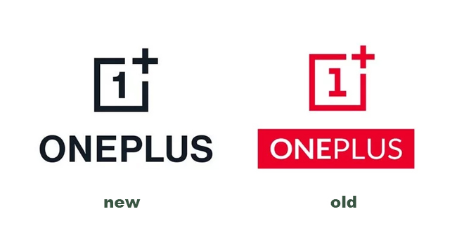
OnePlus revealed its first redesigned logo and visual identity.
OnePlus revealed its first redesigned logo and visual identity as the company was switching to a new font and a curvilinear design.
This, as OnePlus noted that it retained a classic look but with a “more balanced feel, adding that the refreshed logo created “a clearer association between the symbol and the trademark, while also allowing for more flexible application and improved recognizability in digital media.”

The company was also switching into a new font for better readability as well as updating its color palette into cyan, green, magenta, indigo, and yellow “to make the company’s design and assets more vibrant and lively.”
In addition, OnePlus said that the company already worked with in-house creatives and an external agency for over seven months in order to bring the “refreshed brand identity to life.”
Mats Hakansson, global creative director of OnePlus, said that the company wasn’t changing who it was, but reinforcing what it stands for – the true spirit of “Never Settle”, adding that the company felt that “these changes maintain the iconic elements of our brand that are beloved by our staff and our community while injecting both excitement and balance into our visual identity.”
What can you say about this announcement? Just feel free to leave your reactions in the comment section.
Thank you for visiting our website. We hope we have helped you with regard to this matter. You may keep coming back for more informative guides. For more news and updates, follow us on Facebook!
Stay tuned to Philippine Newspaper for more updates.
