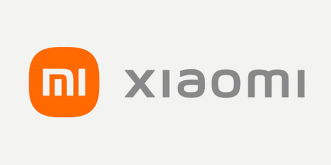
Xiaomi revealed its new branding identity.
Xiaomi on Tuesday announced a refreshed new branding identity, fusing oriental philosophy with the “Alive” design concept.

In Xiaomi’s blog post, the said branding aimed to further strengthen the company’s foothold in the premium market, while raising brand awareness with its audiences through its new dynamic logo.
The company’s new “Alive” branding identity was designed by a world-renowned designer Kenya HARA, who was a professor of Musashino Art University and also the President of the Nippon Design Center (NDC).
Kenya HARA shared that he used the “superellipse” mathematical formula when designing the logo of the company. While there were infinite options between a square and a perfect circle, Kenya HARA achieved a “visually optimal dynamic balance” by adjusting the variables in the said formula.
Using n=3 struck the perfect balance between a circle and a square, epitomizing the core aspect of “Alive”, resulting in the brand new logo we currently saw.
“Compared with a right-angled object, a circle is a shape that is more agile, which is the perfect representation of Xiaomi’s flexibility, relentlessness and its will to move forward,” Xiaomi explained in a blog post.
READ ALSO:
During the second part of Xiaomi 2021 New Product Launch, the company wasn’t blind to the fact that its new logo was pretty similar in appearance to the old logo.
“Are you disappointed at this logo, that we just made our original logo rounder?” asked Xiaomi CEO Lei Jun.
Lei Jun then explained that the company “didn’t just change the shape from square to round” but also changed “the internal spirit as well as the mentality of the brand” as well.
You can watch the launch event below:
For more news and updates, you may feel free to visit this site more often. You may also visit Newspapers.ph via our official Facebook page and YouTube channel.
