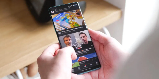
Google Officially Launched YouTube’s Redesigned Video Watch Page For Both Android And iOS
Google officially launched YouTube’s redesigned video watch page for both Android and iOS as Google wanted to focus more on its cleaner design.

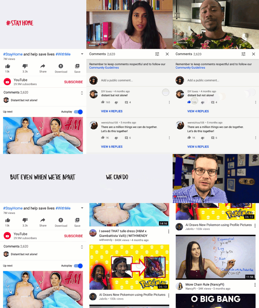
As you opened YouTube app on your mobile devices, you will notice that there’s a lot of changes you can see on its design. Google enumerated YouTube’s latest features, as listed below:
See Comment Preview Below The Video Player
Google placed the comment preview below the video player in order to minimize the space while prioritizing more on enlarging the video thumbnail in the “Up Next” portion. You can tap the comment preview in order to view all the comments and replies.
Larger Thumbnails And Longer Titles In “Up Next” Section
Google enlarged the thumbnails in the “Up Next” portion, which has the same length as the video player.
Other Features
Aside from these changes, Google also added other features such as YouTube Mixes and Community Posts — in a form of text updates, polls, images, GIFs, and more — from your favorite content creators.

Feedback From Users
Following the launch of YouTube’s new features, most of its users didn’t appreciate Google’s effort in achieving a cleaner interface, saying that they don’t like the thumbnails in the “Up Next” portion as it diverts their attention while watching a video.
While the majority of its users wanted to bring back the old version of YouTube, Google has yet to respond regarding this issue.
More updates about this may be posted soon. Thank you for visiting Philippine Newspaper!
